Imagine trying to read a story where you only see the first and last word of every chapter. You would miss all the drama, the twists, and the crucial details in between. That is exactly what looking at a simple line chart feels like to an experienced trader.
To truly understand the "story" of the market, traders use Candlesticks.
Originating from 18th-century Japanese rice merchants, candlesticks have survived centuries for one simple reason: they tell you who is winning the battle between buyers and sellers at a glance. Whether you are trading Bitcoin, stocks, or forex, mastering this visual language is your first step toward professional trading.
The Anatomy of a Candle
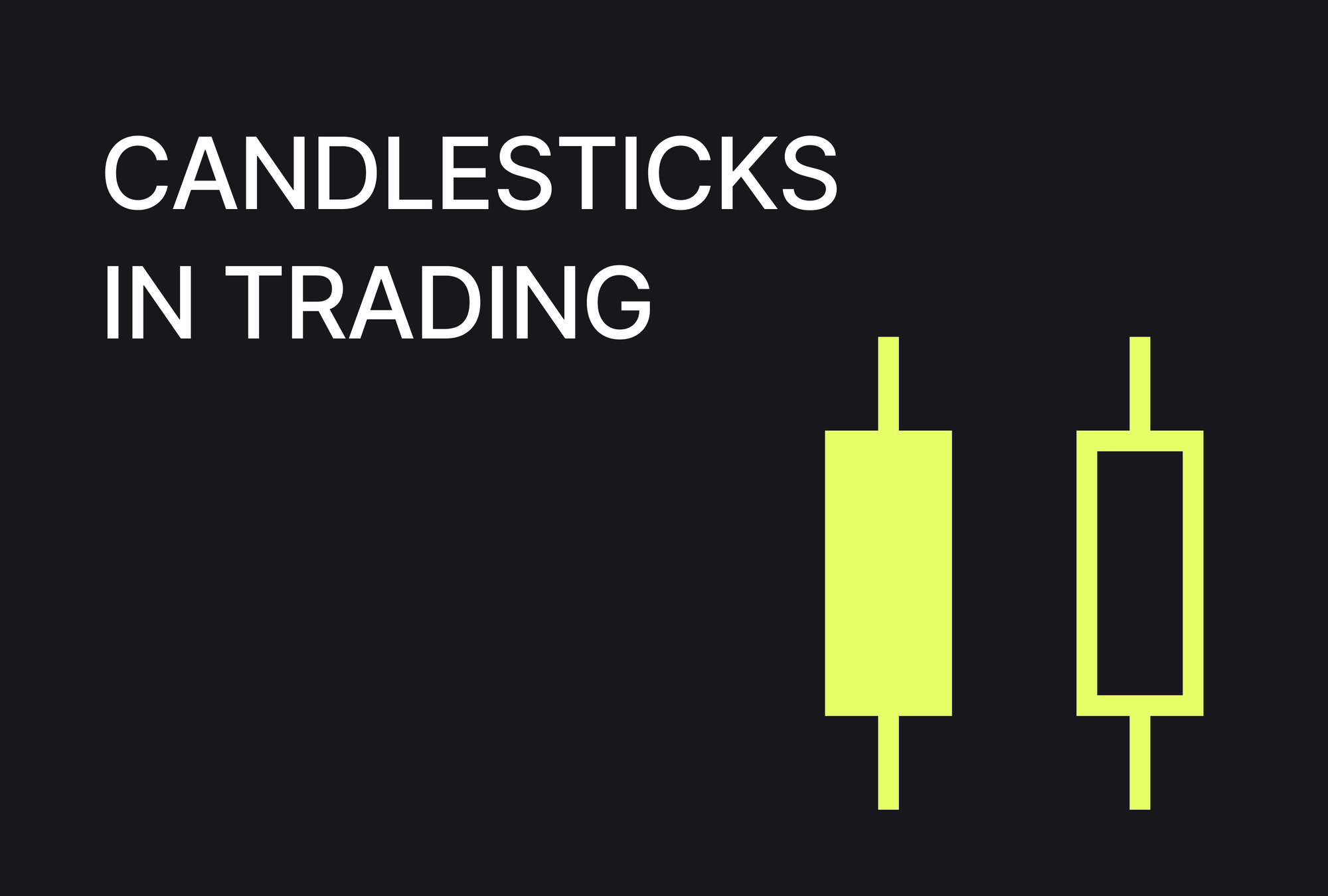
A single candlestick gives you four pieces of information for a specific time period (like one hour or one day). It looks like a rectangular bar with thin lines sticking out of the top and bottom.
- The Body: This is the thick, colored part. It shows the range between the Opening Price (where the price started) and the Closing Price (where the price ended).
- The Wicks (or Shadows): These are the thin lines extending from the body. They show the extreme highs and lows-the highest price buyers pushed to, and the lowest price sellers dragged it down to.
- Shutterstock
Reading the Colors: Bulls vs. Bears
The color tells you the winner of that specific time period.
- Green (or White) = Bullish: The price closed higher than it opened. Buyers (bulls) were in control and pushed the price up. A long green body means strong buying pressure.
- Red (or Black) = Bearish: The price closed lower than it opened. Sellers (bears) took control and drove the price down. A long red body indicates aggressive selling.
3 Essential Candlestick Shapes You Must Know
Not all candles look the same. Sometimes the body is tiny, or the wicks are long. These variations are signals.
1. The Doji (Indecision)
A Doji looks like a plus sign or a cross. The body is almost non-existent because the market opened and closed at virtually the same price.
- What it means: It is a tie. Neither buyers nor sellers won. The market is "indecisive," often signaling that the current trend is running out of steam and might reverse.
- Shutterstock
2. The Hammer (The Reversal Signal)
This looks like a square hammer with a long handle (wick) sticking out the bottom. It appears at the bottom of a downtrend.
- What it means: Sellers tried to push the price down (creating the long lower wick), but buyers stormed back in and pushed it back up to close near the top. It is a strong sign that the price might start rising.
- Note: If you see this shape at the TOP of an uptrend, it is called a Hanging Man, and it warns of a potential drop.
3. The Shooting Star (The Trap)
This is an inverted hammer appearing at the peak of an uptrend. It has a small body at the bottom and a long wick sticking up.
- What it means: Buyers tried to push the price higher, but sellers slapped it back down. It suggests the bulls are exhausted and a downturn might be coming.
Why Context Matters
A single candle is just one sentence in a book. To get the full picture, you need to read the whole paragraph.
- Timeframes: A Hammer candle on a 1-minute chart is mostly noise. A Hammer candle on a Weekly chart is a major signal that could define the market for months.
- Patterns: Traders rarely rely on a single candle. They look for combinations, like a "Bullish Engulfing" pattern, where a green candle completely swallows the previous red one.
Summary
| Feature | Bullish Candle (Green) | Bearish Candle (Red) |
| Open | Bottom of the body | Top of the body |
| Close | Top of the body | Bottom of the body |
| Sentiment | Buyers are in control | Sellers are in control |