Crypto investors are always searching for signals — hints that tell them when Bitcoin is overpriced or when it might be a bargain. While no chart or tool can predict the future with certainty, some visualizations help traders make sense of Bitcoin’s long-term cycles. One of the most popular? The Bitcoin Rainbow Chart.
What Is the Bitcoin Rainbow Chart?
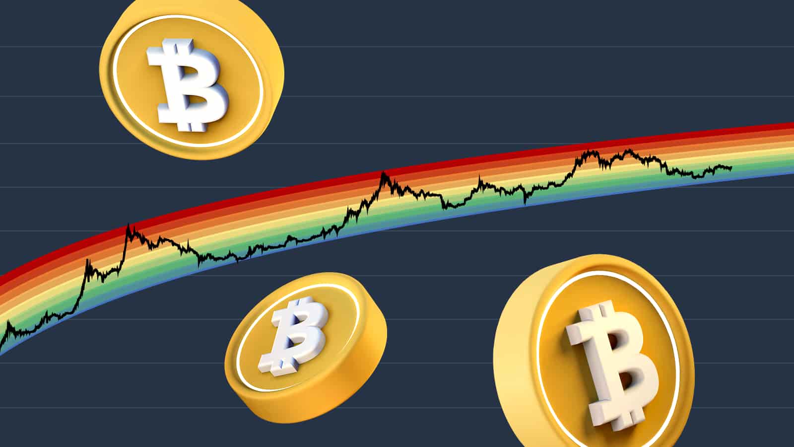
The Bitcoin Rainbow Chart is a colorful, logarithmic chart that overlays Bitcoin’s historical price with rainbow-colored bands. These bands represent different “valuation zones,” ranging from “Bitcoin is dead” at the bottom to “Maximum Bubble Territory” at the top.
As Bitcoin’s price moves up through the bands toward the red end of the rainbow, it’s considered overvalued. When the price dips closer to the blue or purple zones, the asset is seen as undervalued.
It’s important to stress: this is not a crystal ball. The rainbow chart is a visualization tool, not a price predictor.
Origins of the Rainbow Chart
The idea first appeared in 2014, when a Reddit user named azop shared a chart titled “Actual Bitcoin Price vs. Trendline Deviance.” At the time, Bitcoin had just crashed after the 2013 bull run, and the visualization showed BTC sitting in the “very under-valued” blue zone.
Soon after, a Bitcointalk forum user named Trolololo refined the concept. Instead of simple straight lines, they used a logarithmic regression model to smooth out Bitcoin’s extreme price volatility. That adjustment gave the rainbow its distinctive shape.
Over the years, the chart has evolved: from just five color bands in its early form to ten distinct zones today, including labels like “Accumulate,” “HODL,” and “Sell. Seriously, SELL!”
Today, the chart is most commonly seen on Blockchaincenter.net, which updates it with real-time Bitcoin pricing data.
How Does It Work?
- Y-axis (vertical): Bitcoin’s price, shown on a logarithmic scale. This makes exponential growth easier to visualize and compresses the wild price swings into a manageable view.
- X-axis (horizontal): Time, stretching across Bitcoin’s history from its earliest days to today.
- Color bands: Ten different valuation bands, from deep blue (undervalued) to bright red (bubble territory).
- Halving markers: Bitcoin halving events are noted, since they have historically shaped BTC’s four-year price cycles.
By combining these elements, the chart provides a “long lens” view of Bitcoin’s journey — not short-term trading signals.
How Traders Use the Rainbow Chart
Traders and long-term investors use the rainbow chart as one of many tools to gauge Bitcoin’s valuation. It often sits alongside other indicators like:
- Relative Strength Index (RSI) – measures whether BTC is overbought or oversold.
- MACD (Moving Average Convergence/Divergence) – highlights momentum shifts.
- Bollinger Bands – track volatility and price extremes.
But unlike those, the rainbow chart is designed to show macro trends. It’s most useful for framing Bitcoin’s long-term value relative to past cycles — not for timing trades within hours or days.
Limitations to Keep in Mind
The Bitcoin Rainbow Chart is fun and visually appealing, but it comes with caveats:
- Based on history: It relies on past data, and as every disclaimer says, past performance doesn’t guarantee future results.
- Retroactive adjustments: Because the chart is refined with new data, its accuracy looking backward can seem better than it actually was in real time.
- Not for short-term trading: The rainbow chart is much better at illustrating long-term valuation ranges than predicting short-term price moves.
Key Takeaways
- The Bitcoin Rainbow Chart is a long-term valuation tool introduced in 2014.
- It uses a logarithmic regression model with ten color-coded bands to show when BTC may be historically undervalued or overvalued.
- It’s widely used as a visual guide, not a predictive model.
- Best suited for investors looking at multi-year trends rather than short-term trades.
For many in the crypto space, the rainbow chart is less about perfect predictions and more about perspective. It helps investors zoom out, take a breath, and see Bitcoin’s price journey through a broader lens.